Blue Eyed Phoenix
Blue Eyed Phoenix is a piercing and tattoo studio in Vračar: 12+ years of experience, an anatomical approach and high hygiene standards. We built a website that carries their aesthetic, “metal that speaks, skin as canvas”, with local SEO so people in Belgrade find them when looking for a studio they can trust.
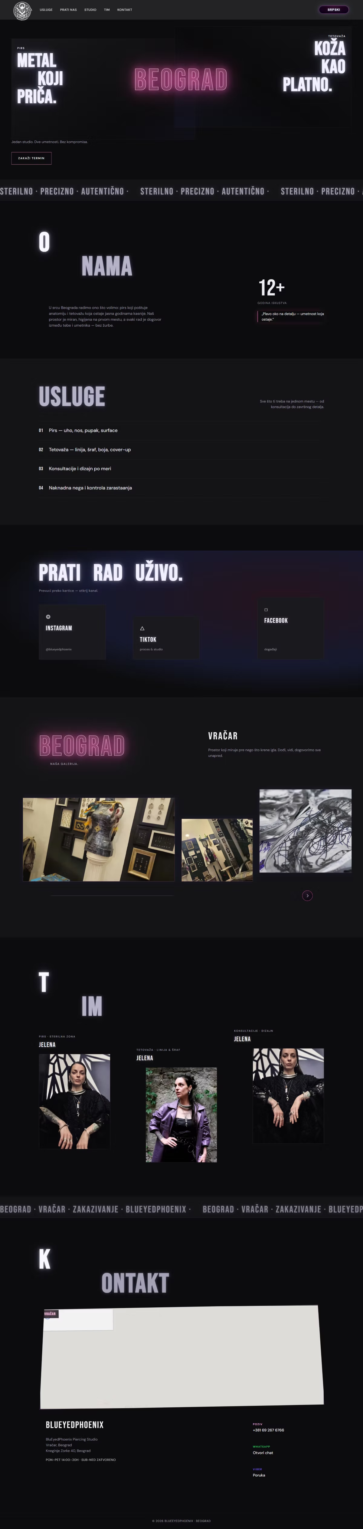
Piercing and tattooing is a business of trust: clients choose a studio on feeling and impression before they ever walk in. A studio with 12 years of experience and a distinct aesthetic had no web presence that carried it, and wasn't visible in local search. The site had to feel artistic and sterile-professional at the same time, and bring people in Belgrade to the studio's door.
A studio gets chosen on impression long before price. So we built the visual direction around their own language: “sterile · precise · authentic”, “a blue eye on the detail”. A dark, calm palette with plenty of space, and photography of the work front and centre, because the work is the only real proof a studio has. Custom WordPress was chosen so the studio adds new work itself, without waiting on someone else to update a gallery.
- Services separated: piercing, tattoo, custom design, aftercare
- Opening hours, the Vračar address and a map on every page
- LocalBusiness schema and geo data for Belgrade
- A CMS the studio adds new work with itself
- Measured Lighthouse mobile performance: 97/100
- Live at pirsingstudiobeograd.rs
How it works.
03 stepsSees the work
The gallery is the first thing a visitor meets, because a tattoo decision is made with the eyes: “metal that speaks, skin as canvas”.
Checks the conditions
Hygiene, the anatomical approach and aftercare: the questions people ask most, answered before they ask.
Finds the studio
The address, opening hours and a map carry the route from phone to door, with no searching elsewhere.
Bebas Neue is tall, condensed and loud: headlines read like the sign above a tattoo studio's window. A bold, urban character that matches “metal that speaks, skin as canvas”.
A vibrant pink carries the entire brand: bold, young and recognizable, exactly like a studio that doesn't shy away from expression.
A more saturated shade of pink for buttons and highlights. It adds energy and leads the eye to action.
A soft pastel rose balances the intensity: gentler details and backgrounds so the pink never tires the eye.
Near-black with a purple undertone: a dramatic base where the pink truly glows.