WE Project
WE Project is an EU project (“Promoting Work-Based Equality for LGBT+Q+ Youth”) researching the experiences of young LGBT+Q+ people at the start of their careers and working to remove workplace discrimination based on sexual orientation and gender identity. It brings together seven organizations from six countries, is coordinated by the Medical University of Vienna and funded by the European Union. We built a website that turns serious research into a clear, accessible tool for multiple audiences.
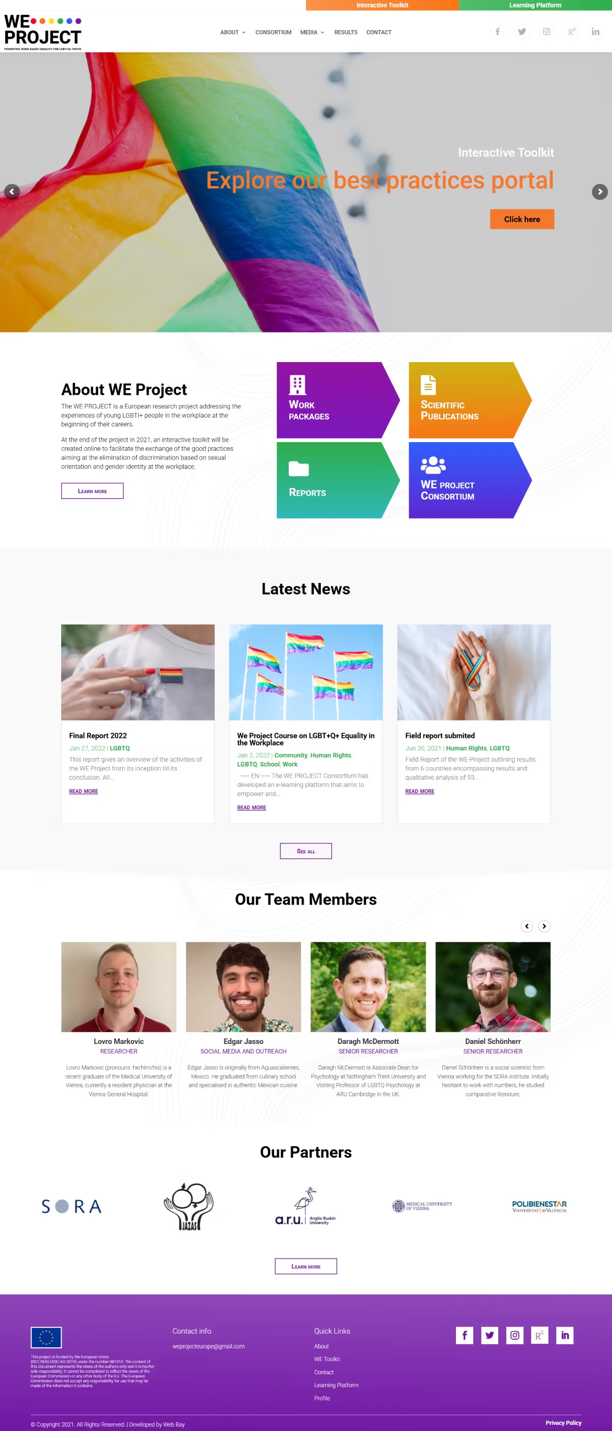
The site had to serve three very different audiences at once: young LGBT+Q+ workers, the professionals who work with them (teachers, psychologists, union representatives) and policymakers. On top of that it carries extensive research material from six countries (a field report, a final report, an interactive toolkit and an e-learning course) that had to stay organized and easy to reach. The subject also demands visible respect for accessibility and a sensitive, professional tone.
A project with three audiences easily ends up as an archive where nobody finds their part. So we tied the structure to the project's goals rather than to document types: a young worker, a professional and a policymaker each enter through a different door. We put the research findings ahead of the material, because a figure stops a reader and a PDF does not. Accessibility was not the last item on a list but a condition, on a subject that is about exclusion.
- A structure built around the project's three goals and three audiences
- The field and final reports of seven partner organizations
- An interactive toolkit and an e-learning course
- Accessibility care built in from the start
- A CMS the project team edits the content with itself
- Live at we-project.eu
How it works.
03 stepsSees they are not alone
Findings from six countries sit up front: 26% hide being LGBT+Q+ at work, 21% experience discrimination.
Finds the tool for their role
A young worker, a professional and a policymaker head toward different material, without searching through all of it.
Learns at their own pace
The interactive toolkit and the e-learning course sit alongside the reports rather than behind them.
Roboto is clear, neutral and accessible. Across multiple languages and audiences (young workers, professionals, policymakers) it reads easily and feels inclusive, without a single exclusionary note.
Purple is traditionally the color of LGBT+Q+ dignity and inclusion. It carries the project's identity clearly and proudly.
Green brings optimism and positive action: hope and progress toward equality in the workplace.
A warm orange for energy and highlights. It leads to the key actions and resources.
A soft dark gray instead of black: a serious yet friendly base for extensive research content.